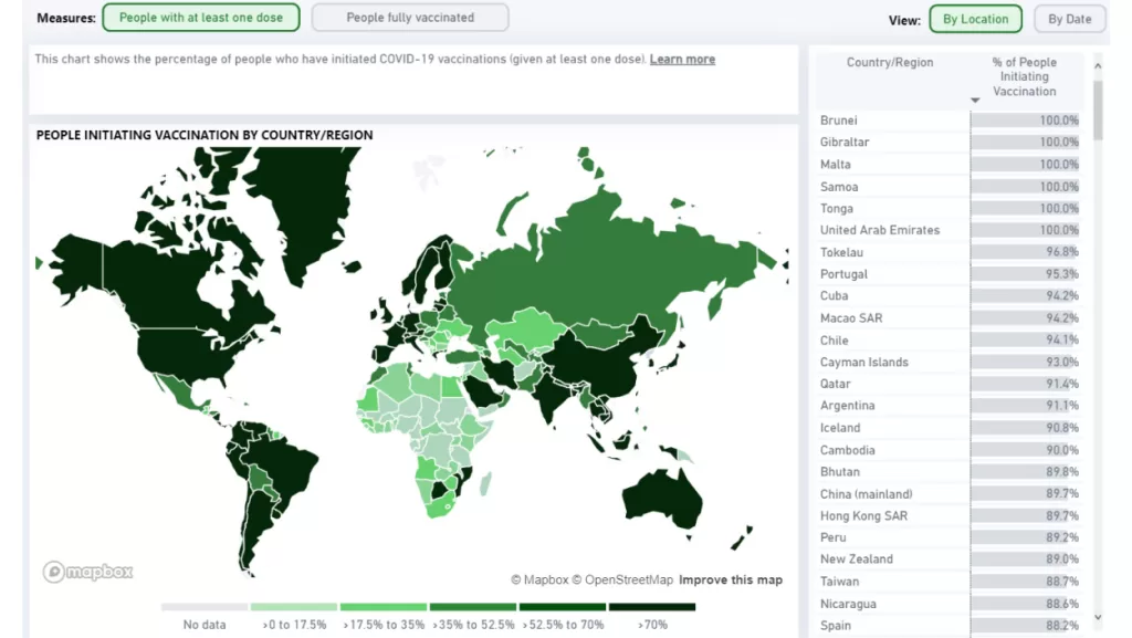
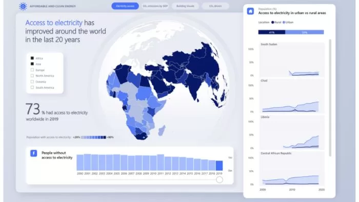
Data visualization is the process of transforming raw data into visual or graphical formats that allow people to understand trends, patterns, and insights in the data.
From bar graphs and pie charts to heat maps and infographics, data visualization tools make complex data more accessible, understandable, and usable.
This guide will help beginners understand the step-by-step process of data visualization.
Table of Contents
Step 1: Understand the Importance of Data Visualization
In our data-driven world, the ability to visualize data effectively is increasingly important. Data visualization can:
- Reveal patterns and trends that text-based data might not show.
- Make complex data more understandable and accessible.
- Enable decision-makers to act on data quickly and effectively.
Step 2: Identify Your Data and Your Goals
Before starting the visualization process, you need to identify the data you will be working with and the goals you hope to achieve. This involves understanding:
- Data Types: Identify the type of data you’re working with quantitative, categorical, or ordinal.
- Goals: What questions are you trying to answer? What insights are you trying to gain? The answers will help guide your choice of visualization.

Step 3: Clean and Prepare Your Data
Data often comes from different sources and in different formats, so it needs to be cleaned and prepared. This could involve:
- Removing duplicates or irrelevant data.
- Dealing with missing values.
- Standardizing and categorizing data.
Step 4: Choose the Right Type of Visualization
Different visualizations serve different purposes. Some common types include:
- Bar graphs: Useful for comparing quantities across categories.
- Line graphs: Ideal for showing trends over time.
- Pie charts: Best for showing parts of a whole.
- Heat maps: Good for showing relationships between two or three variables.
- Scatter plots: Used to display relationships between two numerical variables.
Your choice should depend on your data and the insights you want to communicate.

Step 5: Create Your Visualization
There are many tools available to help you create data visualizations, from simple ones like Excel and Google Sheets to more complex ones like Tableau and PowerBI. Choose a tool that suits your needs and create your visualization.
Step 6: Refine and Share Your Visualization
Once your visualization is complete, take the time to refine it. Make sure it’s clear, concise, and easy to understand. Finally, share your visualization in a report, presentation, or dashboard.
Conclusion
Data visualization is a powerful tool in data analysis and decision-making. It not only makes complex data more understandable but also enables us to see patterns and trends that might be missed in raw data.
By understanding and applying the principles of data visualization, you can unlock the full potential of your data and use it to make informed decisions.
Whether you’re a business professional, researcher, or curious data enthusiast, mastering data visualization is a valuable skill in our increasingly data-driven world.
FAQs
1. What is data visualization?
- Data visualization is the representation of data in graphical or visual formats, such as charts, graphs, and maps, to help people understand the patterns, trends, and insights hidden in complex datasets.
2. Why is data visualization important?
- Data visualization is crucial because it makes complex data more accessible and understandable. It helps individuals and organizations make informed decisions, identify trends, and communicate insights effectively.
3. What types of data can be visualized?
- Virtually any type of data can be visualized, including numerical, categorical, temporal, and spatial data. Data visualization techniques vary based on the nature of the data and the insights you want to convey.
4. What are some common types of data visualizations?
- Common types of data visualizations include bar charts, line graphs, pie charts, scatter plots, heatmaps, treemaps, and more. The choice of visualization depends on the characteristics of the data and the purpose of the analysis.
5. Are there tools available for creating data visualizations?
- Yes, there are numerous tools and software for creating data visualizations. Popular options include Tableau, Microsoft Power BI, Google Data Studio, Excel, and programming libraries like D3.js, Matplotlib, and ggplot2.
6. How can data visualization enhance decision-making?
- Data visualization simplifies complex information, making it easier to identify trends, outliers, and patterns. This, in turn, aids decision-makers in understanding the implications of data, leading to more informed and effective decision-making.
7. What are the key principles of effective data visualization?
- Effective data visualization follows principles such as clarity, simplicity, accuracy, relevance, and consistency. It aims to present information in a way that is easily understandable and avoids misinterpretation.
8. Can data visualization be used for storytelling?
- Yes, data visualization is a powerful tool for storytelling. By presenting data in a narrative format, it helps convey a compelling story, making it easier for the audience to engage with and remember the information.
9. How can beginners start with data visualization?
- Beginners can start with simple tools like Microsoft Excel or Google Sheets for basic visualizations. There are also online courses, tutorials, and books dedicated to teaching data visualization techniques and best practices.
10. Are there ethical considerations in data visualization?
- Yes, ethical considerations in data visualization include avoiding misleading representations, ensuring data privacy, and providing proper context for the presented information. Ethical practices are essential to maintain the integrity of the visualized data.

